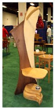
The saw Dust Challenge table and video series has gotten caught up in other work. I haven't forgotten, just had to move it off to the side of my plate for now.
I'm extremely intrigued and caught up in a rather complicated piece for the past 5 weeks. I'm trying a new technique and the results are what I expected. They are good and show loads of potential. Working the machines well, is working the machines. What is making this piece complicated is the veneer selection being used and the layout. Or simply said, the design constraints I've placed on myself.
Over the past 20 or so months I've been engrossed in the study of form and communicating visually. The study has taken me away from viewing furniture and more into color, textiles, graphics, varying center points, on and on. I have my reasons. But combining a new form with sound visual communication is where I'm headed. I've expanded my knowledge base but at the expense of my viewers. Sorry about that, but down the road there's more to share with you. You may have heard me say often, "I don't like going backwards, I like what's in front".

When completed I will get back on the Saw Dust Chronicles Challenge video, and fill you in on this piece.
Stay tuned.....and check back at the end of February 2011 as I go after what is turning into a fun project.
All projects build off of what you've built before. Much of what I've been experimenting with this past 20 months, keeps showing up.
Quite an interesting process for me.
In the infamous words of General Douglas MacArthur......... "I shall return".


2 comments:
Hi Neil,
Well, you have grabbed my attention with this post. I can not quite make out what you are doing from the pictures but it appears that you have inset contrasting veneers into one another. As a woodworker who is always expanding my base of knowledge I can relate to the experience of learning a new technique which in turn opens the mind to a myriad of new design possibilities. In fact, I have been toying around with a similar concept which involves contrasting veneers or laminates. My idea, which has probably already been done before, is to cut patterns/designs in the upper laminate layers with a contrasting colored laminate layer in the middle. As the piece is made of laminates it could be bent and curved to create various forms. The contrasting layers could mimic or create the illusion of space.
I have taken inspiration from your projects and from learning new techniques from these projects (lingerie chest/vacuum press veneering and Carlo Mollino/bent lamination). In other words, through learning new techniques it has opened my mind to new design possibilities. As a home woodworker I am trying to do my part in experimenting with new ideas (at least ideas that are new to me). Now if I can just get the Honey-dos wrapped up I can spend more time in my work shop laboratory making saw dust.
Hope to see you at the Wood Expo in February.
Mike
Medford, MA
Hi Mike.......definitely I'll see you at WoodExpo. Coming up fast.
Your thinking on the layer laminates is interesting, I've done this before but not with patterns and only 2 layers, sounds like your thinking in topographical fashion. COOL!! If this helps, we used a thicker color-core laminate as the top layer, to alleviate the black line that would show in the top layer. We did it in a vertical. Your time for patterns may be here.
There's a guy Michael Ianonne http://iannonedesign.com/ he takes thin stock and laser cuts the laminate (usually white) then laminates on bambbo or kieray(sp?) Check out his site.
COOL Mike......see you soon...Neil
Post a Comment